


![From Gas Station to Google with Self-Taught Cloud Engineer Rishab Kumar [Podcast #158]](https://cdn.hashnode.com/res/hashnode/image/upload/v1738339892695/6b303b0a-c99c-4074-b4bd-104f98252c0c.png?#)


Inequality in Practice: E-commerce Portfolio Analysis
From Mathematical Theory to Actionable Insights: A 6-Year Shopify Case StudyImage generated by DALL-E, based on author’s prompt, inspired by “The Bremen Town Musicians”Are your top-selling products making or breaking your business?It’s terrifying to think your entire revenue might collapse if one or two products fall out of favor. Yet spreading too thin across hundreds of products often leads to mediocre results and brutal price wars.Discover how a 6-year Shopify case study uncovered the perfect balance between focus and diversification.Why bother?Understanding concentration in your product portfolio is more than simply an intellectual exercise; it has a direct impact on crucial business choices. From inventory planning to marketing spend, understanding how your revenue is distributed among goods impacts your approach.This post walks through practical strategies for monitoring concentration, explaining what these measurements actually mean and how to get useful insights from your data.I’ll take you through fundamental metrics and advanced analysis, including interactive visualisations that bring the data to life.I am also sharing chunks of R code used in this analysis. Use it directly or adapt the logic to your preferred programming language.The Concentration QuestionLooking at market analysis or investment theory, we often focus on concentration — how value is distributed across different elements. In e-commerce, this translates into a fundamental question: How much of your revenue should come from your top products?Is it better to have several strong sellers or a broad product range? This isn’t just a theoretical question …Having most of your revenue tied to few products means your operations are streamlined and focused. But what happens when market preferences shift? Conversely, spreading revenue across hundreds of products might seem safer, but it often means you lack any real competitive advantage.So where’s the optimal point? Or rather what is the optimal range, and how various ratios describe it.What makes this analysis particularly valuable is that it is based on real data from a business that kept expanding its product range over time.Getting the Data RightOn DatasetsThis analysis was done for a real US-based e-commerce store — one of our clients who kindly agreed to share their data for this article. The data spans six years of their growth, giving us a rich view of how product concentration evolves as business matures.While working with actual business data gives us genuine insights, I’ve also created a synthetic dataset in one of the later sections. This small, artificial dataset helps illustrate the relationships between various ratios in a more controlled setting — showing patterns “counting on fingers”.To be clear: this synthetic data was created entirely from scratch and only loosely mimics general patterns seen in real e-commerce — it has no direct connection to our client’s actual data. This is different from my previous article, where I generated synthetic data based on real patterns using Snowflake functionality.Data ExportThe main analysis draws from real data, but that small artificial dataset serves an important purpose — it helps explain relationships between various ratios in a way that’s easy to grasp. And trust me, having such a micro dataset with clear visuals comes in really handy when explaining complex dependencies to stakeholders ;-)The raw transaction export from Shopify contains everything we require, but we must arrange it properly for concentration analysis. The data contains all of the products for each transaction, but the date is only in one row per transaction, thus we must propagate it to all products while retaining the transaction id. Probably not for the first iteration of the study, but if we want to fine-tune it, we should consider how to handle discounts, returns, and so on. In the case of foreign sales, conduct a global and country-specific study.We have a product name and an SKU, both of which should adhere to some naming convention and logic when dealing with variants. If we have a master catalogue with all of these descriptions and codes, we are very fortunate. If you have it, use it, but compare it to the ‘ground truth’ with actual transaction data.Product VariantsIn my case, the product names were structured with a base name and a variant separated by a dash. Very simple to use, divided into main product and variants. Exceptions? Of course, they are always present, especially when dealing with 6 years of highly successful ecommerce data:). For instance, some names (e.g. “All-purpose”) included a dash, while others did not. Then, some did have variants, while some did not. So expect for some tweaks here, but this is a critical stage.Number of unique products, with and without variants — all charts rendered by author, with own R codeIf you’re wondering why we need to exclude variations from concentration analysis, the figure above illustrates it clearly. Th

From Mathematical Theory to Actionable Insights: A 6-Year Shopify Case Study

Are your top-selling products making or breaking your business?
It’s terrifying to think your entire revenue might collapse if one or two products fall out of favor. Yet spreading too thin across hundreds of products often leads to mediocre results and brutal price wars.
Discover how a 6-year Shopify case study uncovered the perfect balance between focus and diversification.
Why bother?
Understanding concentration in your product portfolio is more than simply an intellectual exercise; it has a direct impact on crucial business choices. From inventory planning to marketing spend, understanding how your revenue is distributed among goods impacts your approach.
This post walks through practical strategies for monitoring concentration, explaining what these measurements actually mean and how to get useful insights from your data.
I’ll take you through fundamental metrics and advanced analysis, including interactive visualisations that bring the data to life.
I am also sharing chunks of R code used in this analysis. Use it directly or adapt the logic to your preferred programming language.
The Concentration Question
Looking at market analysis or investment theory, we often focus on concentration — how value is distributed across different elements. In e-commerce, this translates into a fundamental question: How much of your revenue should come from your top products?
Is it better to have several strong sellers or a broad product range? This isn’t just a theoretical question …
Having most of your revenue tied to few products means your operations are streamlined and focused. But what happens when market preferences shift? Conversely, spreading revenue across hundreds of products might seem safer, but it often means you lack any real competitive advantage.
So where’s the optimal point? Or rather what is the optimal range, and how various ratios describe it.
What makes this analysis particularly valuable is that it is based on real data from a business that kept expanding its product range over time.
Getting the Data Right
On Datasets
This analysis was done for a real US-based e-commerce store — one of our clients who kindly agreed to share their data for this article. The data spans six years of their growth, giving us a rich view of how product concentration evolves as business matures.
While working with actual business data gives us genuine insights, I’ve also created a synthetic dataset in one of the later sections. This small, artificial dataset helps illustrate the relationships between various ratios in a more controlled setting — showing patterns “counting on fingers”.
To be clear: this synthetic data was created entirely from scratch and only loosely mimics general patterns seen in real e-commerce — it has no direct connection to our client’s actual data. This is different from my previous article, where I generated synthetic data based on real patterns using Snowflake functionality.
Data Export
The main analysis draws from real data, but that small artificial dataset serves an important purpose — it helps explain relationships between various ratios in a way that’s easy to grasp. And trust me, having such a micro dataset with clear visuals comes in really handy when explaining complex dependencies to stakeholders ;-)
The raw transaction export from Shopify contains everything we require, but we must arrange it properly for concentration analysis. The data contains all of the products for each transaction, but the date is only in one row per transaction, thus we must propagate it to all products while retaining the transaction id. Probably not for the first iteration of the study, but if we want to fine-tune it, we should consider how to handle discounts, returns, and so on. In the case of foreign sales, conduct a global and country-specific study.
We have a product name and an SKU, both of which should adhere to some naming convention and logic when dealing with variants. If we have a master catalogue with all of these descriptions and codes, we are very fortunate. If you have it, use it, but compare it to the ‘ground truth’ with actual transaction data.
Product Variants
In my case, the product names were structured with a base name and a variant separated by a dash. Very simple to use, divided into main product and variants. Exceptions? Of course, they are always present, especially when dealing with 6 years of highly successful ecommerce data:). For instance, some names (e.g. “All-purpose”) included a dash, while others did not. Then, some did have variants, while some did not. So expect for some tweaks here, but this is a critical stage.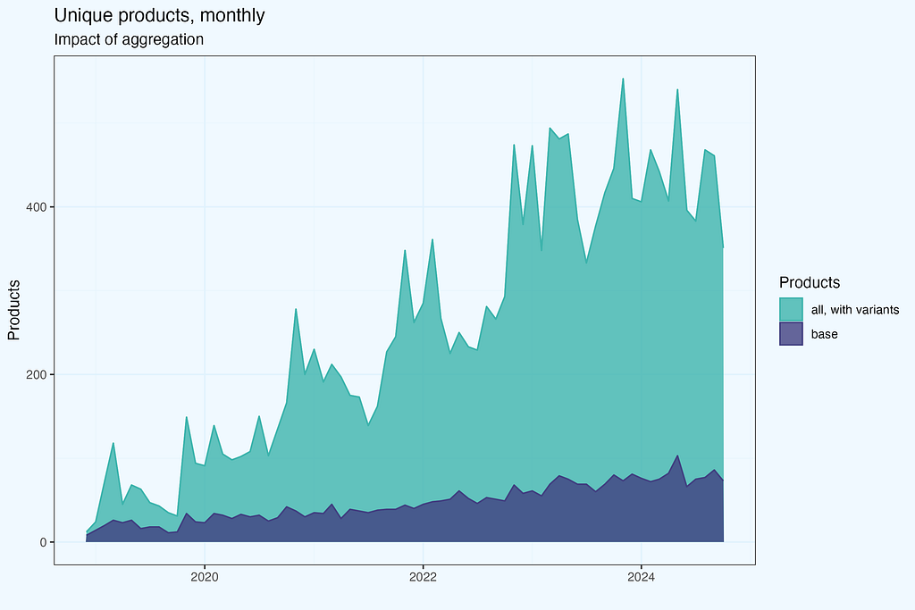
If you’re wondering why we need to exclude variations from concentration analysis, the figure above illustrates it clearly. The values are considerably different, and we would expect radically different results if we analysed concentration with variants.
The analysis is based on transactions, counting number of products with/without variants in a given month. But if we have a large number of variants, not all of them will be present in one-month transactions. Yes, that is correct — so let us consider a larger time range, one year.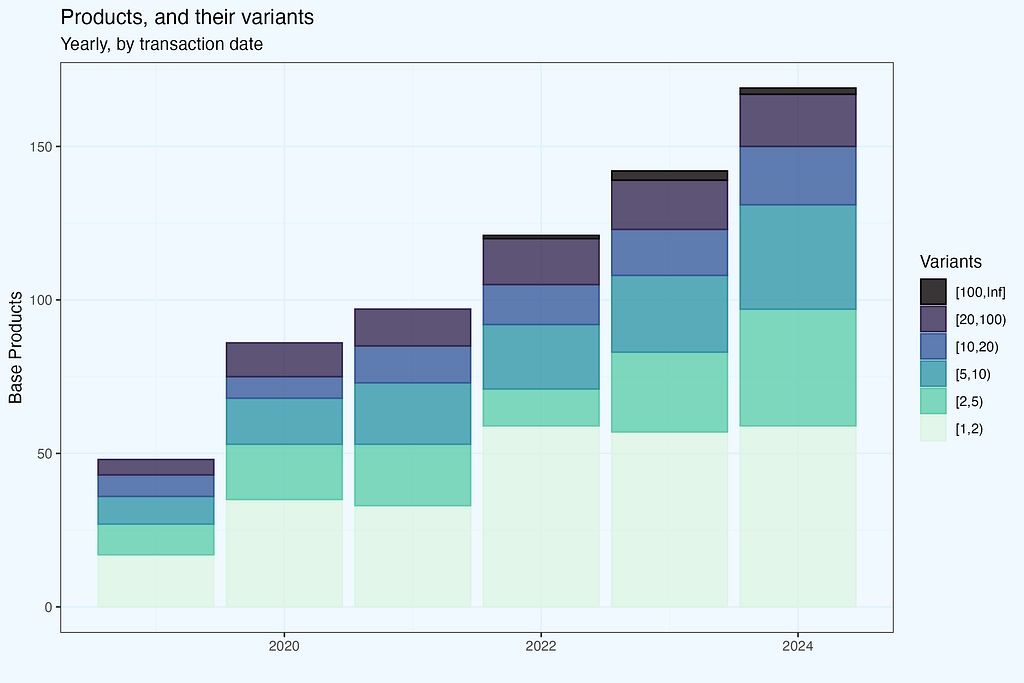
I calculated the number of variants per base product in a calendar year based on what we have in transactions. The number of variants per base product is divided into several bins. Let’s take the year 2024. The plot shows that we have somewhat around 170 base items, with less than half having only one variant (light green bar). However, the other part had more than one version, and what is noteworthy (and, I believe, non-obvious, unless you work in apparel ecommerce) is that we have products with a really large number of versions. The black bin contains items that come in 100 or more different variants.
If you guessed that they were increasing their offerings by introducing new products while keeping old ones available, you are correct. But wouldn’t it be interesting to know whether the differences stem from heritage or new products? What if we just included products introduced in the current year? We may check it by using the date of product introduction rather than transactions. Because our only dataset is a transaction dump, the first transaction for each product is taken as the introduction date. And for each product, we take all versions that appeared in transactions, with no time constraints (from product introduction to the most current record).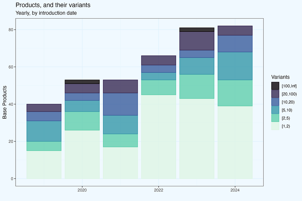
Now let’s have these two plots side by side for easy comparison. Taking transactions dates we have more products in each year, and the difference grows — since there are also transactions with products introduced previously. No suprises here, as expected. If you were wondering why data for 2019 differ — nice catch. In fact, shop started operation in 2018, but I removed these few initial months; still, it is their impact what makes the difference in 2019.
Products variants and it’s impact on revenue is not our focus in this article. But as it is often in real analysis, there are ‘branching’ options, as we progress, even in the initial phase. We haven’t even finished data preparation, and it is already getting interesting.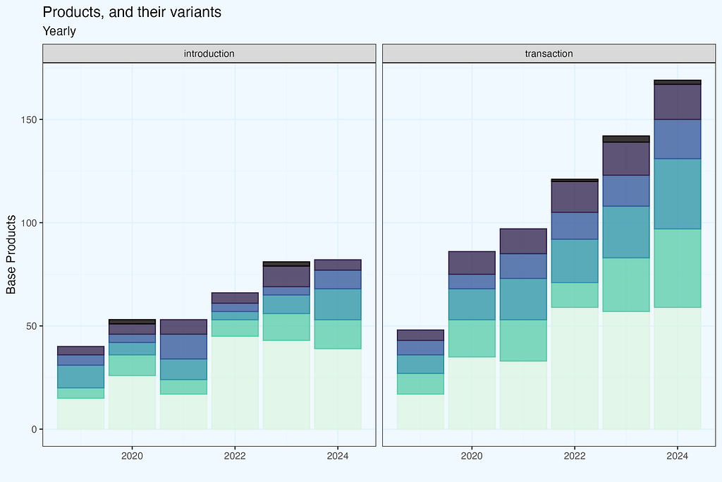

Understanding the product structure is critical for conducting meaningful concentration analyses. Now that our data is appropriately formatted, we can examine actual concentration measurements and what they reveal about ideal portfolio structure. In the following part, we’ll look at these measurements and what they mean for e-commerce businesses.
Measuring Concentration — theory meets practice
When it comes to determining concentration, economists and market analysts have done the heavy lifting for us. Over decades of research into markets, competitiveness, and inequality, they’ve produced powerful analytical methods that have proven useful in a variety of sectors. Rather than developing novel metrics for e-commerce portfolio analysis, we can use existing time-tested methods.
Let’s see how theoretical frameworks can shed light on practical e-commerce questions.
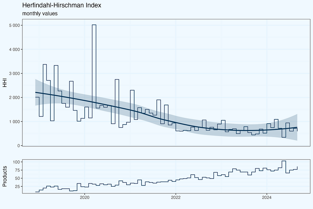
Herfindahl-Hirschman Index
HHI (Herfindahl-Hirschman Index) is probably the most common way to measure concentration. Regulators use it to check if a market isn’t becoming too concentrated — they take percentages of each company’s market share, square them, and add up. Simple as that. The result can be anywhere from nearly 0 (many small players) to 10,000 (one company takes it all).
Why use HHI for e-commerce portfolio analysis? The logic is straightforward — instead of companies competing in a market, we have products competing for revenue. The math works exactly the same way — we take each product’s share of total revenue, square it, and sum up. High HHI means revenue depends on few products, while low HHI shows revenue is spread across many products. This gives us a single number to track portfolio concentration over time.
Pareto
Who has not heard of Pareto’s rules? In 1896, Italian economist Vilfredo Pareto observed that 20% of the population held 80% of Italy’s land. Since then, this pattern has been found in a variety of fields, including wealth distribution and retail sales.
While popularly referred to as the “80/20 rule,” the Pareto principle is not limited to these figures. We can use any x-axis criterion (for example, the top 30% of products) to determine the appropriate y value (revenue contribution). The Lorenz curve, formed by linking these locations, provides a complete picture of concentration.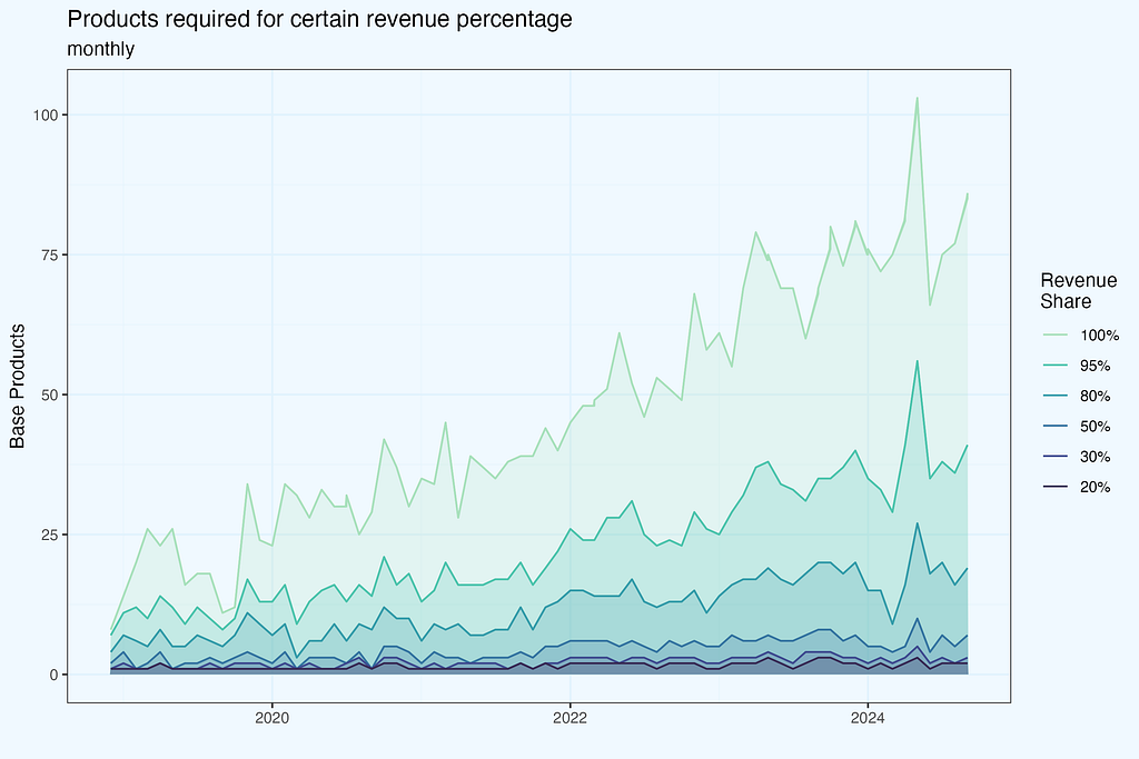
The chart above shows how many products do we need to achieve certain revenue share (of the monthly revenue). I took arbitrarily cuts at .2, .3, .5, .8, .95, and of course also including 1 — which means total number of products, contributing to 100% of revenue in a given month.
Lorenz curve
If we sort products by their revenue contribition, and chart the line, we get Lorenz curve. On both axis we have percentages, of products and their reveue share. I case of perfectly uniform revenue distribution, we’d have a straight line, while in case of “perfect concentration”, very steep curve, climbing close to 100% revenue, and then rapidly turning right, to include some residual revenue from other products.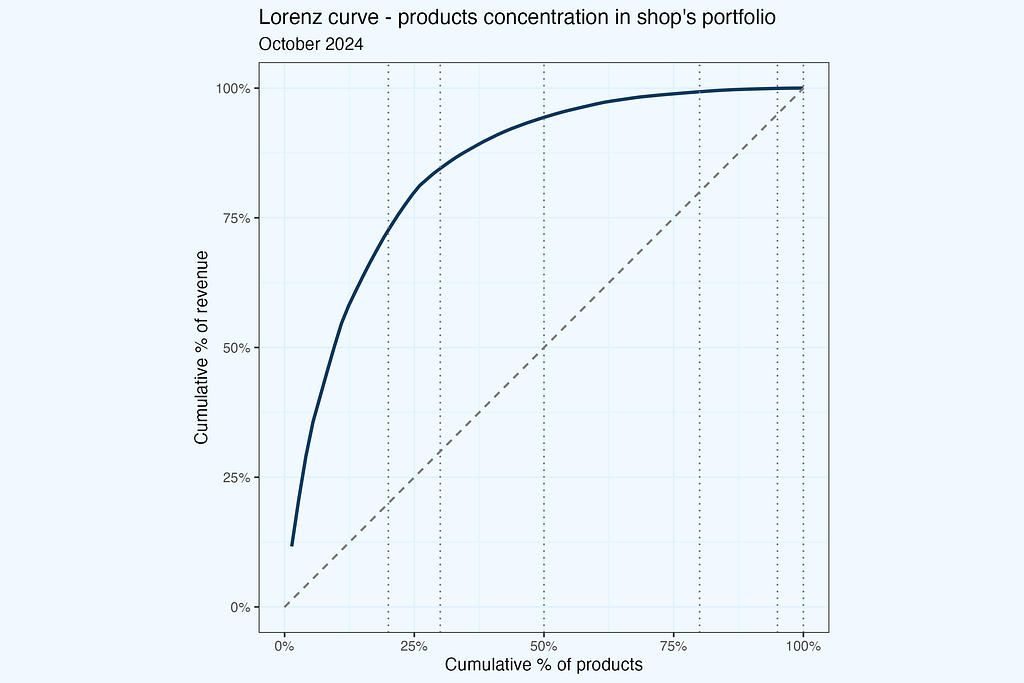
It is interesting to see that line, but in most cases it will look quite similar, like a “bended stick”. So let us now compare these lines for few previous months, and also few years back (sticking to October). The monthly lines are quite similar, and if you think — it would be good to have some interactivity in this plot, you are absolutely right. The yearly comparison shows more differences (we still have monthly data, taking October in each year), and this is understandable, since these measurements are more distant in time.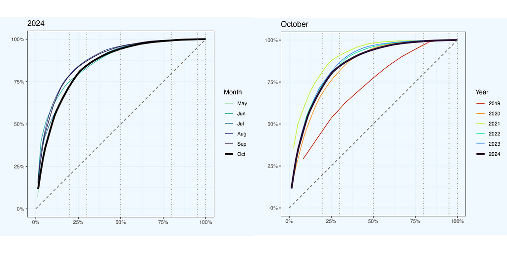
So we do see differences between the lines, but can’t we quantify them somehow, not to rely entirely on visual similarity? Definitely, and there is a ratio for that — Gini Ratio. And by the way, we will have quite a lot of ratios in next chapters.
Gini Ratio
To translate shape of Lorenz curve into numeric value, we can use Gini ratio — defined as a ratio between two areas, above and below the equality line. On a plot below it is a ratio between dark and light blue areas.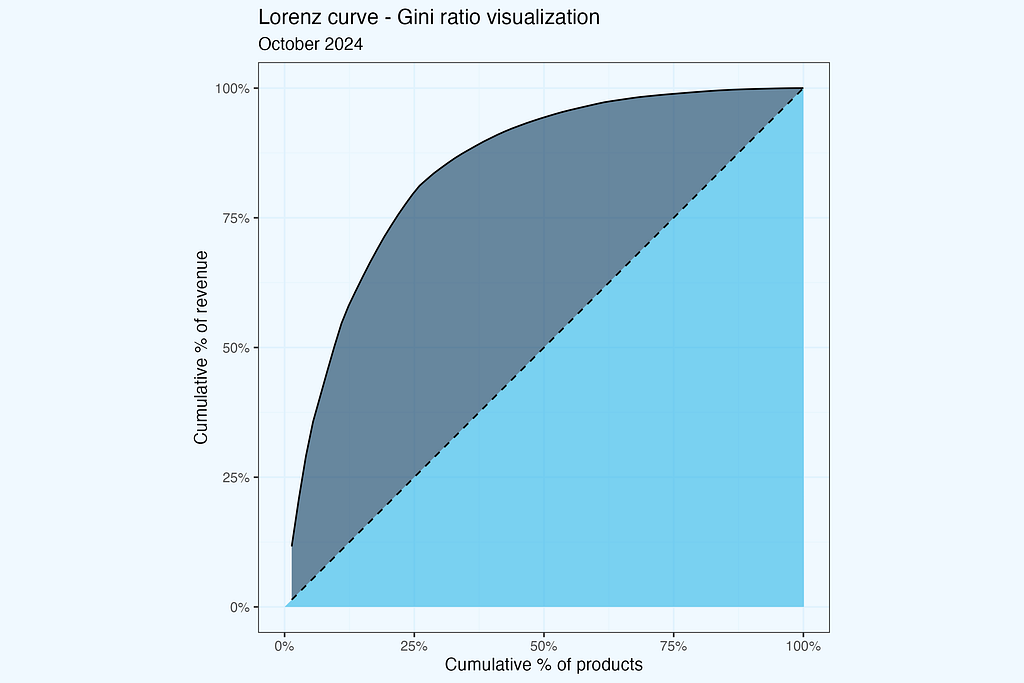
Let us then visualize for two periods — October 2019, and October 2024, exact same periods, as we have on one of the plots before.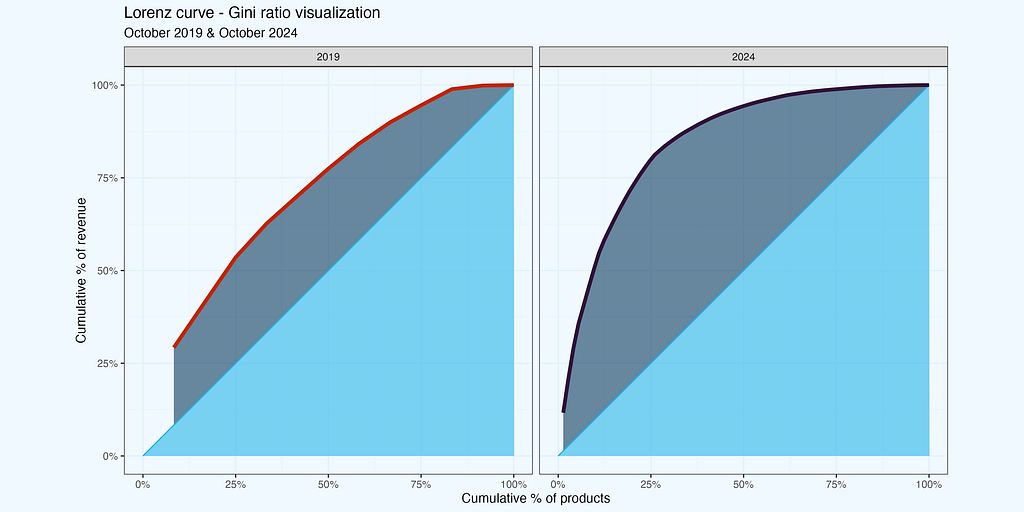
Once we have good understanding, with visuals, how the Gini ratio is calculated, let’s plot it, over the whole period.
I use R for analysis, so I have Gini ratio easily available (as well as other ratios, which I will show later). The initial data table (x3a_dt) contains revenue per product, per month. The resulting one has Gini ratio per month.
#-- calculate Gini ratio, monthly
library(data.table, ineq)
x3a_ineq_dt <- x3a_dt[, .(gini = ineq::ineq(revenue, type = "Gini")), month]
Good we have all these packages for heavy lifting. The math behind is not super complicated, but our time is precious.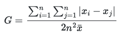
The plot below shows the result of calculations.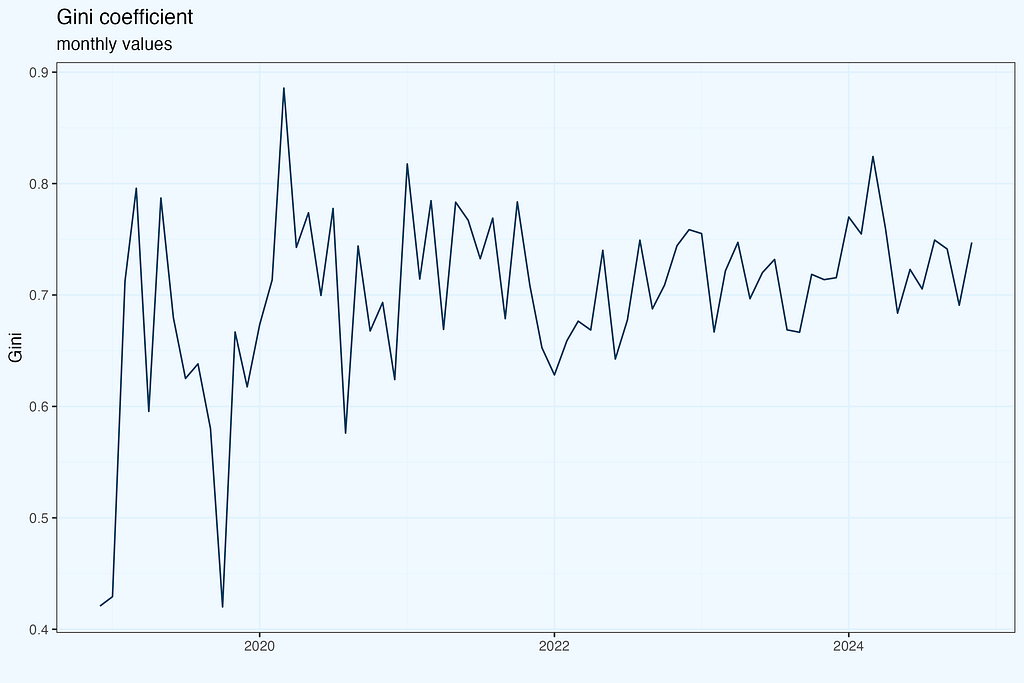
I haven’t included a smoothing line, with its confidence interval channel, since we do not have measurement points, but the result of Gini calculation, with its own errors distribution. To be very strict and precise on math, we’d need to calculate the confidence interval, and based on that plot smoothed line. The results are below.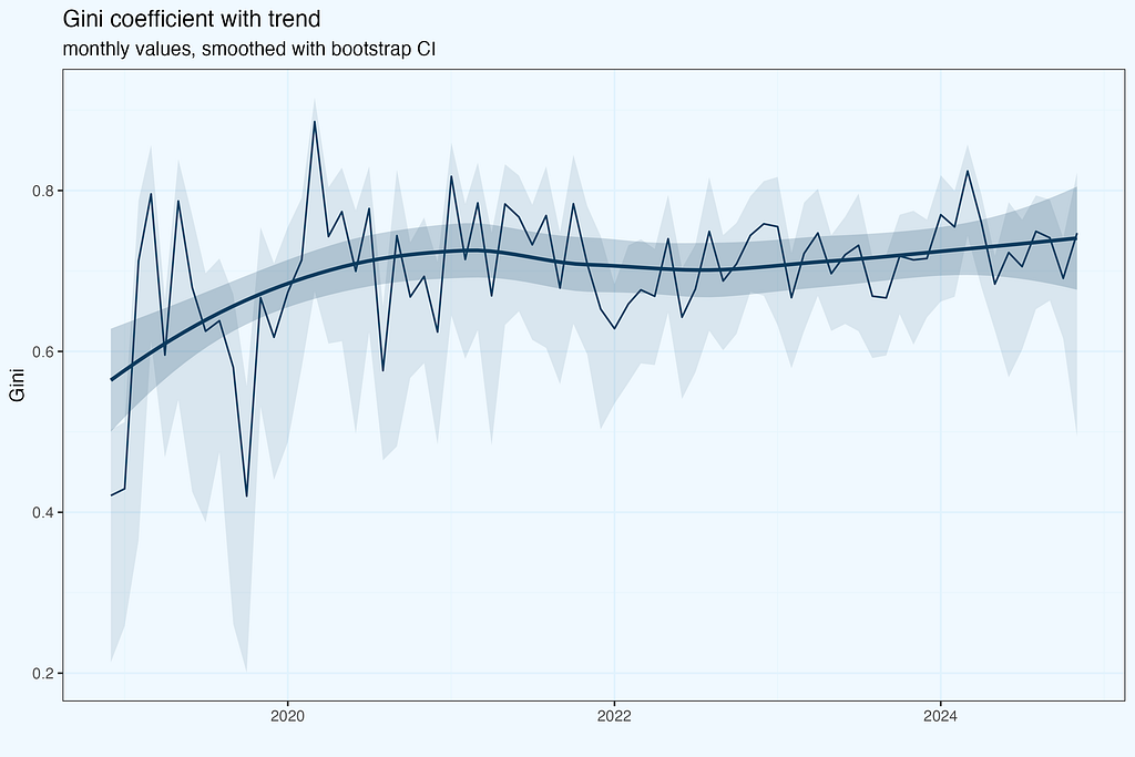
Since we do not use directly statistical significance of calculated ratio, this super strict approach is a little bit an overkill. I haven’t done it while charting trend line for HHI, nor will do in next plots. But it is good to be aware of this nuance.
We have seen so far two ratios — HHI and Gini, and they are far from being identical. Lorenz curve closer to diagonal indicates more uniform distribution, which is what we have for October 2019, but the HHI is higher, than for 2024, indicating more concentration in 2019. Maybe I made a mistake in calculations, even worse, early on during data preparation? That would be really unfortunate. Or the data is ok, but we are struggling with proper interpretation?
I have quite often moments of such doubts, especially when moving with the analysis really quick. So how do we cope with that, tightening grip on data and our understanding of dependencies? Bear in mind, that whatever analysis you do, there is always first time. And quite often we do not have a luxury of ‘leisure’ research, it is more often already work for a Client (or a superior, stakeholder, whoever requested it, even ourselves, if it is our initiative).
Tightening grip
We need to have a good understanding of how to interpret all these ratios, including dependencies between them. If you plan to present your results to others, questions here are guaranteed, so better to be well prepared. We can work with an existing dataset, or we can generate a small set, where it will be easier to catch dependencies. Let us follow the latter approach.
Let us start with creating a small dataset,
library(data.table)

#-- Create sample revenue data
revenue <- list(
  "2021" = rep(15, 10),                    # 10 values of 15
  "2022" = c(rep(100, 5), rep(10, 25)),    # 5 values of 100, 25 values of 10
  "2023" = rep(25, 50),                    # 50 values of 25
  "2024" = c(rep(100, 30), rep(10, 70))    # 30 values of 100, 70 values of 10
)
combining it into a data.table.
#-- Convert to data.table in one step
x_dt <- data.table(
  year = rep(names(revenue), sapply(revenue, length)),
  revenue = unlist(revenue)
)
A quick overview of the data.
It seems we have what we needed — a simple dataset, but still quite realistic. Now we are proceeding with calculations and charts, similar to what we had for a real dataset before.
#-- HHI, Gini
xh_dt <- x_dt[, .(hhi = ineq::Herfindahl(revenue),
                  gini = ineq::Gini(revenue)), year]
#-- Lorenz
xl_dt <- x_dt[order(-revenue), .(
  cum_prod_pct = seq_len(.N)/.N,
  cum_rev_pct = cumsum(revenue)/sum(revenue)), year]
And rendering plots.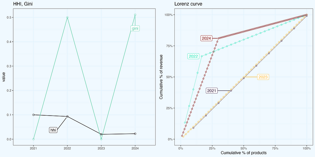
These charts help a lot in understanding ratios, relations between them and to data. It is always a good idea to have such micro analysis, for ourselves and for stakeholders — as ‘back pocket’ slides, or even sharing them upfront.
Nerdy detail — how to slightly shift the line, so it doesn’t overlap, and add labels within a plot? Render a plot, and then make manual fine tuning, expecting several iterations.
#-- shift the line
xl_dt[year == "2021", `:=` (cum_rev_pct = cum_rev_pct - .01)]
For labelling I use ggrepel, but as a default, it will label all the points, while we need only one per line. An in addition deciding which one, for good looking chart.
#-- decide which points to label
labs_key2_dt <- data.table(
  year = c("2021", "2022", "2023", "2024"), position = c(4, 5, 25, 30))

#-- set keys
list(xl_dt, labs_key2_dt) |> lapply(setkey, year)

#-- join
label_positions2 <- xl_dt[
  labs_key2_dt, on = .(year), # join on 'year'
  .SD[get('position')],       # Use get('position') to reference the position from labs_key_dt
  by = .EACHI]                # for each year
Render the plot.
#-- render plot
plot_22b <- xl_dt |>
  ggplot(aes(cum_prod_pct, cum_rev_pct, color = year, group = year, label = year)) +
  geom_line(linewidth = .2) +
  geom_point(alpha = .8, shape = 21) +
  theme_bw() +
  scale_color_viridis_d(option = "H", begin = 0, end = 1) +
  ggrepel::geom_label_repel(
    data = label_positions2, force = 10,
    box.padding = 2.5, point.padding = .3,
    seed = 3, direction = "x") +
... additional styling
More Ratios
I began with HHI, the Lorenz curve, and the accompanying Gini ratios, as they appeared to be good starting points for concentration and inequality measurements. However, there are numerous different ratios used to define distributions, whether for inequality or in general. It’s unlikely that we’d employ all of them at once, therefore select the subset that provides the most insights for your specific challenge.
With a proper structure of a dataset, it is quite straightforward to calculate them. I am sharing code snippets, with several ratios calculated monthly. We use a dataset, we already have — monthly revenue per product (base products, excluding variants).
Starting with ratios from the ineq package.
#---- inequality ----
x3_ineq_dt <- x3a_dt[, .(
  # Classical inequality/concentration measures
  gini     = ineq::ineq(revenue, type = "Gini"),      # Gini coefficient
  hhi      = ineq::Herfindahl(revenue),               # Herfindahl-Hirschman Index
  hhi_f    = sum((rev_pct*100)^2),                    # HHI - formula
  atkinson = ineq::ineq(revenue, type = "Atkinson"),  # Atkinson index
  theil    = ineq::ineq(revenue, type = "Theil"),     # Theil entropy index
  kolm     = ineq::ineq(revenue, type = "Kolm"),      # Kolm index
  rs       = ineq::ineq(revenue, type = "RS"),        # Ricci-Schutz index
  entropy  = ineq::entropy(revenue),                  # Entropy measure
  hoover   = mean(abs(revenue - mean(revenue)))/(2 * mean(revenue)), # Hoover (Robin Hood) index
Diustribution shape and top/bottom shares and ratios.
 # Distribution shape measures
  cv       = sd(revenue)/mean(revenue),               # Coefficient of Variation
  skewness = moments::skewness(revenue),              # Skewness
  kurtosis = moments::kurtosis(revenue),              # Kurtosis

  # Ratio measures
  p90p10   = quantile(revenue, 0.9)/quantile(revenue, 0.1),   # P90/P10 ratio
  p75p25   = quantile(revenue, 0.75)/quantile(revenue, 0.25), # Interquartile ratio
  palma    = sum(rev_pct[1:floor(.N*.1)])/sum(rev_pct[floor(.N*.6):(.N)]), # Palma ratio
  # Concentration ratios and shares
  top1_share  = max(rev_pct),                         # Share of top product
  top3_share  = sum(head(sort(rev_pct, decreasing = TRUE), 3)),  # CR3
  top5_share  = sum(head(sort(rev_pct, decreasing = TRUE), 5)),  # CR5
  top10_share = sum(head(sort(rev_pct, decreasing = TRUE), 10)), # CR10
  top20_share = sum(head(sort(rev_pct, decreasing = TRUE), floor(.N*.2))),  # Top 20% share
  mid40_share = sum(sort(rev_pct, decreasing = TRUE)[floor(.N*.2):floor(.N*.6)]), # Middle 40% share
  bottom40_share = sum(tail(sort(rev_pct), floor(.N*.4))),      # Bottom 40% share
  bottom20_share = sum(tail(sort(rev_pct), floor(.N*.2))),      # Bottom 20% share
Basic statistics, quantiles.
 # Basic statistics
  unique_products = .N,                              # Number of unique products
  revenue_total = sum(revenue),                      # Total revenue
  mean_revenue = mean(revenue),                      # Mean revenue per product
  median_revenue = median(revenue),                  # Median revenue
  revenue_sd = sd(revenue),                          # Revenue standard deviation

  # Quantile values
  q20 = quantile(revenue, 0.2),                      # 20th percentile
  q40 = quantile(revenue, 0.4),                      # 40th percentile
  q60 = quantile(revenue, 0.6),                      # 60th percentile
  q80 = quantile(revenue, 0.8),                      # 80th percentile
Count measures.
 # Count measures
  above_mean_n = sum(revenue > mean(revenue)),        # Number of products above mean
  above_2mean_n = sum(revenue > 2*mean(revenue)),     # Number of products above 2x mean
  top_quartile_n = sum(revenue > quantile(revenue, 0.75)), # Number of products in top quartile
  zero_revenue_n = sum(revenue == 0),                 # Number of products with zero revenue
  within_1sd_n = sum(abs(revenue - mean(revenue)) <= sd(revenue)),    # Products within 1 SD
  within_2sd_n = sum(abs(revenue - mean(revenue)) <= 2*sd(revenue)),  # Products within 2 SD
Revenue above (or below) the threshold.
  # Revenue above threshold
  rev_above_mean = sum(revenue[revenue > mean(revenue)])  # Revenue from products above mean
), month]
The resulting table has 40 columns, and 72 rows (months).
As mentioned earlier, it is difficult to imagine, one would work with 40 ratios, so I am rather showing a method how to calculate them, and one should pick relevant ones. As always, it is good to visualize and see how they relate to each other.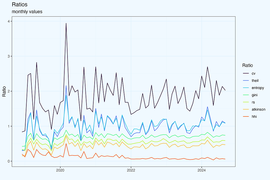
We can calculate correlation matrix between all ratios, or selected subset.
# Select key metrics for a clearer visualization
key_metrics <- c("gini", "hhi", "atkinson", "theil", "entropy", "hoover",
                 "top1_share", "top3_share", "top5_share", "unique_products")

cor_matrix <- x3_ineq_dt[, .SD, .SDcols = key_metrics] |> cor()
Change column names to more friendly names.
# Make variable names more readable
pretty_names <- c(
  "Gini", "HHI", "Atkinson", "Theil", "Entropy", "Hoover",
  "Top 1%", "Top 3%", "Top 5%", "Products"
)
colnames(cor_matrix) <- rownames(cor_matrix) <- pretty_names
And render the plot.
corrplot::corrplot(cor_matrix,
         type = "upper",
         method = "color",
         tl.col = "black",
         tl.srt = 45,
         diag = F,
         order = "AOE")

And then we can plot some interesting pairs. Of course, some of them have positive or negative correlation by definition, while in other cases it is not that obvious.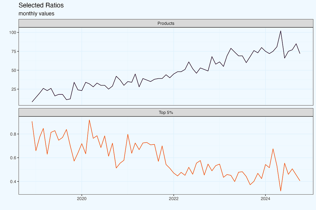
Show me the money
We started analysis with ratios and Lorenz curve as a top-down overview. It is a good start, but there are two complications — the ratios have a relatively broad range, when the business is doing ok, and there is hardly connection to actionable insights. Even if we notice that the ratio is on the edge, or outside of the safe range, it is unclear what we should do. And instructions like “decrease concentration” are a little ambiguous.
E-commerce talks and breaths products, so to make analysis relatable, we need to reference to particular products. People would also like to understand which products constitute core 50%, 80% of revenue, and equally important, if these products stay consistently as top contributors.
Let us take one month, August 2024 and see which products contributed to 50% revenue in that month. Then, we check revenue from these exact products in other months. There are 5 products, generating (at least) 50% revenue in August.
We can also render more visually appealing plot with a streamgraph. Both plots show exact same dataset, but they complement each other nicely — bar plots for precision, while streamgraph for a story.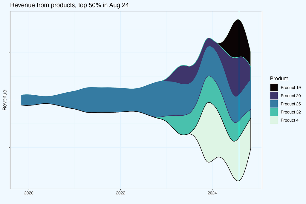
The red line indicated selected month. If you feel “itching” to shift that line, like in an old-fashioned radio, you are absolutely right — that should be an interactive chart, and actually it is, along with a slider for revenue share percentage (we produced it for a Client).
So what if we shift that red ‘tuning line’ a little bit backwards, maybe to 2020? The logic in data preparation is very similar — get products contributing to a certain revenue share threshold, and check the revenue from these products in other months.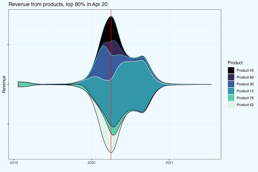
With interactivity on two elements — revenue contribution percentage and the date, one can learn a lot about the business, and this is exactly the point of these charts. One can look from different angles:
- concentration, how many products do we need for certain revenue threshold,
- products themselves, do they stay in certain revenue contribution bin, or do they change and why? Is it seasonality, a valid replacement, lost supplier or something else?
- time window, whether we look at one month or a whole year,
- seasonality, comparing similar time of a year with previous periods.
Summary
What the Data Tells Us
Our 6-year dataset reveals the evolution of an e-commerce business from high concentration to balanced growth. Here are the key patterns and lessons:
With 6 years of data, I had a unique chance to watch concentration metrics evolve as the business grew. Starting with just a handful of products, I saw exactly what you’d expect — sky-high concentration. But as new products entered the mix, things got more interesting. The business found its rhythm with a dozen or so top performers, and the HHI settled into a comfortable 700–800 range.
Here’s something fascinating I discovered: concentration and inequality might sound like twins, but they’re more like distant cousins. I noticed this while comparing HHI against Lorenz curves and their Gini ratios. Trust me, you’ll want to get comfortable with the math before explaining these patterns to stakeholders — they’ll smell uncertainty from a mile away.
Want to really understand these metrics? Do what I did: create a dummy dataset so simple it’s almost embarrassing. I’m talking basic patterns that a fifth-grader could grasp. Sounds like overkill? Maybe, but it saved me countless hours of head-scratching and misinterpretation. Keep these examples in your back pocket — or better yet, share them upfront. Nothing builds confidence like showing you’ve done your homework.
Look, calculating these ratios isn’t rocket science. The real magic happens when you dig into how each product contributes to your revenue. That’s why I added the “show me the money” section — I don’t believe in quick fixes or magic formulas. It’s about rolling up your sleeves and understanding how each product really behaves.
As you’ve probably noticed yourself, these streamgraphs I showed you are practically begging for interactivity. And boy, does that add value! Once you’ve got your keys and joins sorted out, it’s not even that complicated. Give your users an interactive tool, and suddenly you’re not drowning in one-off questions anymore — they’re finding insights themselves.
Here’s a pro tip: use this concentration analysis as your foot in the door with stakeholders. Show your product teams that streamgraph, and I guarantee their eyes will light up. When they start asking for interactive versions, you’ve got them hooked. The best part? They’ll think it was their idea all along. That’s how you get real adoption — by letting them discover the value themselves.
Data Engineering Takeaways
While quite often we generally know what to expect in a dataset, it is almost guaranteed that there will be some nuances, exceptions, or maybe even surprises. It’s good to spend some time reviewing datasets, using dedicated functions (like str, glimpse in R), looking for empty fields, outliers, but also simply scrolling through to understand the data. I like comparisons, and in this case, I’d compare to smelling fish on a market before jumping to prepare sushi :-)
Then, if we work with a raw data export, quite likely there will be several columns in the data dump; after all, if we click ‘export all’, wouldn’t we expect exactly that? For most analysis we will need a subset of these columns, so it’s good to trim and keep only what we need. I assume we work with a script, so if it turns out, we need more, not an issue, just add missed column and rerun that chunk.
In the dataset dump there was a timestamp in one row per transaction, while we needed it per each product. Hence some light data wrangling to propagate these timestamps to all the products.
After cleaning the dataset, it’s important to consider the context of analysis, including the questions to be answered and the necessary changes to the data. This “contextual cleaning/wrangling” is critical since it determines whether the analysis succeeds or fails. In our situation, the goal was to analyse product concentration, therefore filtering out variants (size, colour, etc.) was essential. If we had skipped that, the outcome would have been radically different.
Quite often we can expect some “traps”, where initially it seems we can apply simple approach, while actually, we should add a bit of sophistication. As an example — Lorenz curve, where we need to calculate how many products do we need to get to a certain revenue threshold. This is where I use rolling joins, which fit here perfectly.
The core logic to produce streamgraphs is to find products which constitute certain revenue percentage in a given month, then “freeze” them and get their revenue in other months. The toolset I used was adding extra column, with a product number, after sorting per month, and then playing with keys and joins.
An important element of this analysis was adding interactivity, allowing users to play with some parameters. That raises the bar, as we need all these operations to be performed lightning fast. The ingredients we need are right data structure, additional columns, proper keys and joins. Prepare as much as possible, precalculating in a data warehouse, so the dashboarding tool is not overloaded. Take caching into account.
How to Start?
Strike a balance between delivering what stakeholders request and exploring potentially valuable insights they haven’t asked for yet. The analysis I presented follows this pattern — getting initial concentration ratios is straightforward, while building an interactive streamgraph optimized for lightning-fast operation requires significant effort.
Start small and engage others. Share basic findings, discuss what you could learn together, and only then proceed with more labor-intensive analysis once you’ve secured genuine interest. And always maintain a solid grip on your raw data — it’s invaluable for answering those inevitable ad-hoc questions quickly.
Building a prototype before full production allows for validation of interest and feedback without devoting too much time. In my case, such simple concentration ratios sparked debates that eventually led to the more advanced interactive studies on which stakeholders rely today.
Appendix — data preparation & wrangling
I’ll show you how I prepared the data at each step of this analysis. Since I used R, I’ll include the actual code snippets — they’ll help you get started faster, even if you’re working in a different language. This is the code I used for the study, though you’ll probably need to adapt it to your specific needs rather than just copying it over. I decided to keep the code separate from the main analysis, to make it more streamlined and readable for both technical and business users.
While I am presenting analysis based on Shopify export, there is no limitation for a particular platform, we just need transactions data.
Shopify export
Let’s start with getting our data from Shopify. The raw export needs some work before we can dive into concentration analysis — here’s what I had to deal with first.
We start with export of raw transactions data from Shopify. It might take some time, and when ready, we get an email with links to download.
#-- 0. libs
pacman::p_load(data.table)

#-- 1.1 load data; the csv files are what we get as a full export from Shopify
xs1_dt <- fread(file = "shopify_raw/orders_export_1.csv")
xs2_dt <- fread(file = "shopify_raw/orders_export_2.csv")
xs3_dt <- fread(file = "shopify_raw/orders_export_3.csv")
Once we have data, we need to combine these files into one dataset, trim columns and perform some cleansing.
#-- 1.2 check all columns, limit them to essential (for this analysis) and bind into one data.table
xs1_dt |> colnames()
# there are 79 columns in full export,
# so we select a subset, relevant for this analysis
sel_cols <- c("Name", "Email", "Paid at", "Fulfillment Status", "Accepts Marketing", "Currency", "Subtotal",
              "Lineitem quantity", "Lineitem name", "Lineitem price", "Lineitem sku", "Discount Amount",
              "Billing Province", "Billing Country")

#-- combine into one data.table, with a subset of columns
xs_dt <- data.table::rbindlist(l = list(xs1_dt, xs2_dt, xs3_dt),
    use.names = T, fill = T, idcol = T) %>% .[, ..sel_cols]
Some data preparations.
#-- 2. data prep
#-- 2.1 replace spaces in column names, for easier handling
sel_cols_new <- sel_cols |> stringr::str_replace(pattern = " ", replacement = "_")
setnames(xs_dt, old = sel_cols, new = sel_cols_new)

#-- 2.2 transaction as integer
xs_dt[, `:=` (Transaction_id = stringr::str_remove(Name, pattern = "#") |> as.integer())]
Anonymize emails, as we don’t need/want to deal with real emails during analysis.
#-- 2.3 anonymize email
new_cols <- c("Email_hash")
xs_dt[, (new_cols) := .(digest::digest(Email, algo = "md5")), .I]
Change column types; this depends on personal preferences.
#-- 2.4 change Accepts_Marketing to logical column
xs_dt[, `:=` (Accepts_Marketing_lgcl = fcase(
    Accepts_Marketing == "yes", TRUE,
    Accepts_Marketing == "no", FALSE,
    default = NA))]
Now we focus on transactions dataset. In the export files, the transaction amount and timestamp is in only one row per all items in the basket. We need to get these timestamps and propagate to all items.
#-- 3 transactions dataset
#-- 3.1 subset transactions
#-- limit columns to essential for transaction only
trans_sel_cols <- c("Transaction_id", "Email_hash", "Paid_at",
  "Subtotal", "Currency", "Billing_Province", "Billing_Country")

#-- get transactions table based on requirement of non-null payment - as payment (date, amount) is not for all products, it is only once per basket
xst_dt <- xs_dt[!is.na(Paid_at) & !is.na(Transaction_id), ..trans_sel_cols]
#-- date columns
xst_dt[, `:=` (date = as.Date(`Paid_at`))]
xst_dt[, `:=` (month = lubridate::floor_date(date, unit = "months"))]
Some extra information, as I call them, derivatives.
#-- 3.2 is user returning? their n-th transaction
setkey(xst_dt, Paid_at)
xst_dt[, `:=` (tr_n = 1)][, `:=` (tr_n = cumsum(tr_n)), Email_hash]

xst_dt[, `:=` (returning = fcase(tr_n == 1, FALSE, default = TRUE))]
Do we have any NA’s in the dataset?
xst_dt[!complete.cases(xst_dt), ]
Products dataset.
#-- 4 products dataset
#-- 4.1 subset of columns
sel_prod_cols <- c("Transaction_id", "Lineitem_quantity", "Lineitem_name",
  "Lineitem_price", "Lineitem_sku", "Discount_Amount")
Now we join these two datasets, to have transaction characteristics (trans_sel_cols) for all the products.
#-- 5 join two datasets
list(xs_dt, xst_dt) |> lapply(setkey, Transaction_id)
x3_dt <- xs_dt[, ..sel_prod_cols][xst_dt]
Let’s check which columns we have in x3_dt dataset.
And it is also a moment to inspect the dataset.
x3_dt |> str()
x3_dt |> dplyr::glimpse()
x3_dt |> head()
Time for data cleaning. First up: splitting the Lineitem_name into base products and their variants. In theory, these are separated by a dash (“-”). Simple, right? Not quite — some product names, like ‘All-Purpose’, contain dashes as part of their name. So we need to handle these special cases first, temporarily replacing problematic dashes, doing the split, and then restoring the original product names.
#-- 6. cleaning, aggregation on product names
#-- 6.1 split product name into base and variants
#-- split product names into core and variants
product_cols <- c("base_product", "variants")
#-- with special treatment for 'all-purpose'
x3_dt[stringr::str_detect(string = Lineitem_name, pattern = "All-Purpose"),
  (product_cols) := {
    tmp = stringr::str_replace(Lineitem_name, "All-Purpose", "AllPurpose")
    s = stringr::str_split_fixed(tmp, pattern = "[-/]", n = 2)
    s = stringr::str_replace(s, "AllPurpose", "All-Purpose")
    .(s[1], s[2])
  }, .I]
It is good to make validation after each step.
# validation
x3_dt[stringr::str_detect(
  string = Lineitem_name, pattern = "All-Purpose"), .SD,
  .SDcols = c("Transaction_id", "Lineitem_name", product_cols)]
We keep moving with data cleaning — the exact steps depend of course on a particular dataset, but I share my flow, as an example.
#-- two scenarios, to cope with `(32-ounce)` in prod name; we don't want that hyphen to cut the name
x3_dt[stringr::str_detect(string = `Lineitem_name`, pattern = "ounce", negate = T) &
  stringr::str_detect(string = `Lineitem_name`, pattern = "All-Purpose", negate = T),
  (product_cols) := {
    s = stringr::str_split_fixed(string = `Lineitem_name`, pattern = "[-/]", n = 2); .(s[1], s[2])
  }, .I]

x3_dt[stringr::str_detect(string = `Lineitem_name`, pattern = "ounce", negate = F) &
  stringr::str_detect(string = `Lineitem_name`, pattern = "All-Purpose", negate = T),
  (product_cols) := {
    s = stringr::str_split_fixed(string = `Lineitem_name`, pattern = "\\) - ", n = 2); .(paste0(s[1], ")"), s[2])
  }, .I]

#-- small patch for exceptions
x3_dt[stringr::str_detect(string = base_product, pattern = "\\)\\)$", negate = F),
  base_product := stringr::str_replace(string = base_product, pattern = "\\)\\)$", replacement = ")")]
Validation.
# validation
x3_dt[stringr::str_detect(string = `Lineitem_name`, pattern = "ounce")
  ][, .SD, .SDcols = c(eval(sel_cols[6]), product_cols)
  ][, .N, c(eval(sel_cols[6]), product_cols)]

x3_dt[stringr::str_detect(string = `Lineitem_name`, pattern = "All")
  ][, .SD, .SDcols = c(eval(sel_cols[6]), product_cols)
  ][, .N, c(eval(sel_cols[6]), product_cols)]

x3_dt[stringr::str_detect(string = base_product, pattern = "All")]
We use eval(sel_cols[6]) to get the name of a column sel_cols[6] which is Currency.
We also need to deal with NA’s, but with an understanding of a dataset — where we could have NA’s and where they are not supposed to be, indicating an issue. In some columns, like `Discount_Amount`, we have values (actual discount), zeros, but also sometimes NA’s. Checking final price, we conclude they are zeros.
#-- deal with NA'a - replace them with 0
sel_na_cols <- c("Discount_Amount")
x3_dt[, (sel_na_cols) := lapply(.SD, fcoalesce, 0), .SDcols = sel_na_cols]
For consistency and convenience, changing all column names to lowercase.
setnames(x3_dt, tolower(names(x3_dt)))
And verification.
Of course review dataset, with some test aggregations, and also just printing it out.
Save dataset as both Rds (native R format) and csv.
x3_dt |> fwrite(file  = "data/products.csv")
x3_dt |> saveRDS(file = "data/x3_dt.Rds")
Conducting steps above we should have a clean dataset, for futher analysis. The code should serve as a guideline, but also can be used directly, if you work in R.
Versions
As a first glimpse, we will check number of products per month, both base_product, and including all versions.
As a small cleaning, I take only complete months.
month_last <- x3_dt[, max(month)] - months(1)
Then we count monthly numbers, storing in temporary table, which are then joined.
x3_a_dt <- x3_dt[month <= month_last, .N, .(base_product, month)
  ][, .(base_products = .N), keyby = month]

x3_b_dt <- x3_dt[month <= month_last, .N, .(lineitem_name, month)
  ][, .(products = .N), keyby = month]

x3_c_dt <- x3_a_dt[x3_b_dt]

Some data wrangling.
#-- names, as we want them on plot
setnames(x3_c_dt, old = c("base_products", "products"), new = c("base", "all, with variants"))

#-- long form
x3_d_dt <- x3_c_dt[, melt.data.table(.SD, id.vars = "month", variable.name = "Products")]

#-- reverse factors, so they appear on plot in a proper order
x3_d_dt[, `:=` (Products = forcats::fct_rev(Products))]

We are ready to plot the dataset.
plot_01_w <- x3_d_dt |>
  ggplot(aes(month, value, color = Products, fill = Products)) +
  geom_line(show.legend = FALSE) +
  geom_area(alpha = .8, position = position_dodge()) +
  theme_bw() +
  scale_fill_viridis_d(direction = -1, option = "G", begin = 0.3, end = .7) +
  scale_color_viridis_d(direction = -1, option = "G", begin = 0.3, end = .7) +
  labs(x = "", y = "Products",
    title = "Unique products, monthly", subtitle = "Impact of aggregation") +
  theme(... additional styling)
The next plot shows the number of variants grouped into bins. This gives us a chance to talk about chaining operations in R, particularly with the data.table package. In data.table, we can chain operations by opening a new bracket right after closing one — resulting in ][ syntax. It creates a compact, readable chain that’s still easy to debug since you can execute it piece by piece. I prefer succinct code, but that’s just my style — use whatever approach works best for you. We can write code in one line, or multi-line, with logical steps.
On one of the plots we look at a date, when each product was first seen. To get that date, we set a key on date, and then take the first occurrence date[1] per each base_product.
#-- versions per year, product, with a date, when it was 1st seen
x3c_dt <- x3_dt[, .N, .(base_product, variants)
  ][, .(variants = .N), base_product][order(-variants)]

x3_dt |> setkey(date)
x3d_dt <- x3_dt[, .(date = date[1]), base_product]
list(x3c_dt, x3d_dt) |> lapply(setkey, base_product)

x3e_dt <- x3c_dt[x3d_dt][order(variants)
  ][, `:=` (year = year(date) |> as.factor())][year != 2018
  ][, .(products = .N), .(variants, year)][order(-variants)
  ][, `:=` (
    variant_bin = cut(
      variants,
      breaks = c(0, 1, 2, 5, 10, 20, 100, Inf),
      include.lowest = TRUE,
      right = FALSE
    ))
  ][, .(total_products = sum(products)), .(variant_bin, year)
  ][order(variant_bin)
  ][, `:=` (year_group = fcase(
    year %in% c(2019, 2020, 2021), "2019-2021",
    year %in% c(2022, 2023, 2024), "2022-2024"
  ))
  ][, `:=` (variant_bin = forcats::fct_rev(variant_bin))]
The resulting table is exactly as we need it for charting.
The second plot uses transaction date, so the data wrangling is similar, but without date[1] step.
If we want to have a couple of plots combined, we can produce them separately, and combine using for example ggpubr::ggarrange() or we can blend tables into one dataset and then use faceting functionality. The former is when plots are of completely different nature, while latter is useful, when we can naturally have combined dataset.
As an example, few more lines from my script.
x3h_dt <- data.table::rbindlist(
  l = list(
    introduction = x3e_dt[, `:=` (year = as.numeric(as.character(year)))],
    transaction  = x3g_dt),
  use.names = T, fill = T, idcol = T)

And a plot code.
plot_04_w <- x3h_dt |>
  ggplot(aes(year, total_products,
    color = variant_bin, fill = variant_bin, group = .id)) +
  geom_col(alpha = .8) +
  theme_bw() +
  scale_fill_viridis_d(direction = 1, option = "G") +
  scale_color_viridis_d(direction = 1, option = "G") +
  labs(x = "", y = "Base Products",
    title = "Products, and their variants",
    subtitle = "Yearly",
    fill = "Variants",
    color = "Variants") +
  facet_wrap(".id", ncol = 2) +
  theme(... other styling options)
Faceting has massive advantage, because we operate on one table, which helps a lot in assuring data consistency.
Pareto
The essence of Pareto calculation is to find how many products do we need to achieve certain revenue percentage. We need to prepare the dataset, in a couple of steps.
#-- calculate quantity and revenue per base_product, monthly
x3a_dt <- x3_dt[, {
  items = sum(lineitem_quantity, na.rm = T);
  revenue = sum(lineitem_quantity * lineitem_price);
  .(items, revenue)}, keyby = .(month, base_product)
  ][, `:=` (i = 1)][order(-revenue)][revenue > 0, ]

#-- calculate percentage share, and cumulative percentage
x3a_dt[, `:=` (
  rev_pct = revenue / sum(revenue),
  cum_rev_pct = cumsum(revenue) / sum(revenue), prod_n = cumsum(i)), month]
In case we’d need to mask exact product names, let us create a new variable.
#-- products name masking
x3a_dt[, masked_name := paste("Product", .GRP), by = base_product]

And dataset printout, with a subset of columns.
And filtered for one month, showing few lines from top and from the bottom.
The essential column is cum_rev_pct, which indicates cumulative percentage revenue from products 1-n. We need to find which prod_n covers revenue percentage threshold, as in the pct_thresholds_dt table.
So we are ready for actual Pareto calculation. The code below, with comments.
#-- pareto
#-- set percentage thresholds
pct_thresholds_dt <- data.table(cum_rev_pct = c(0, .2, .3, .5, .8, .95, 1))

#-- set key for join
list(x3a_dt, pct_thresholds_dt) |> lapply(setkey, cum_rev_pct)

#-- subset columns (optional)
sel_cols <- c("month", "cum_rev_pct", "prod_n")

#-- perform a rolling join - crucial step!
x3b_dt <- x3a_dt[, .SD[pct_thresholds_dt, roll = -Inf], month][, ..sel_cols]
Why do we perform a rolling join? We need to find the first cum_rev_pct to cover each threshold.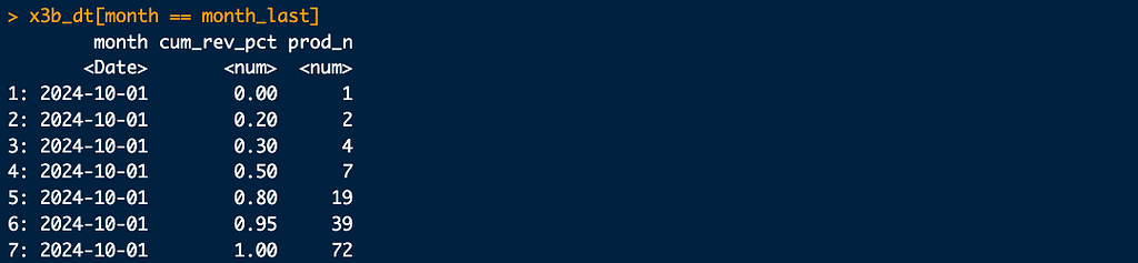
We need 2 products for 20% revenue, 4 products for 30% and so on. And to have 100% revenue, of course we need contribution from all 72 products.
And a plot.
#-- data prep
x3b1_dt <- x3b_dt[month < month_max,
  .(month, cum_rev_pct = as.factor(cum_rev_pct) |> forcats::fct_rev(), prod_n)]

#-- charting
plot_07_w <- x3b1_dt |>
  ggplot(aes(month, prod_n, color = cum_rev_pct, fill = cum_rev_pct)) +
  geom_line() +
  theme_bw() +
  geom_area(alpha = .2, show.legend  = F, position = position_dodge(width = 0)) +
  scale_fill_viridis_d(direction = -1, option = "G", begin = 0.2, end = .9) +
  scale_color_viridis_d(direction = -1, option = "G", begin = 0.2, end = .9,
                        labels = function(x) scales::percent(as.numeric(as.character(x)))  # Convert factor to numeric first
  ) +
  ... other styling options ...
Lorenz curve
To plot Lorenz curve, we need to sort products by it’s contribution to total revenue, and normalize both number of products and revenue.
Before the main code, a handy method to pick n-th month from the dataset, from beginning or from the end.
month_sel <- x3a_dt$month |> unique() |> sort(decreasing = T) |> dplyr::nth(2)
And the code.
xl_oct24_dt <- x3a_dt[month == month_sel,
  ][order(-revenue), .(
    cum_prod_pct = seq_len(.N)/.N,
    cum_rev_pct = cumsum(revenue)/sum(revenue))]
To chart separate lines per each time period, we need to modify accordingly.
#-- Lorenz curve, yearly aggregation
xl_dt <- x3a_dt[order(-revenue), .(
    cum_prod_pct = seq_len(.N)/.N,
    cum_rev_pct = cumsum(revenue)/sum(revenue)), month]

The xl_dt dataset is ready for charting.
Indices, ratios
The code is straightforward here, assuming sufficient prior data preparation. The logic and some snippets in the main body of this article.
Streamgraph
The streamgraph shown earlier is an example of a chart that may appear difficult to render, especially when interactivity is required. One of the reasons I included it in this blog is to show how we can simplify tasks with keys, joins, and data.table syntax in particular. Using keys, we can achieve very effective filtering for interactivity. Once we have a handle on the data, we’re virtually done; all that remains are some settings to fine-tune the plot.
We start with thresholds table.
#-- set percentage thresholds
pct_thresholds_dt <- data.table(cum_rev_pct = c(0, .2, .3, .5, .8, .95, 1))
Since we want joins performed monthly, it is good to create a data subset covering one month, to test the logic, before extending for a full dataset.
#-- test logic for one month
month_sel <- as.Date("2020-01-01")
sel_a_cols <- c("month", "rev_pct", "cum_rev_pct", "prod_n", "masked_name")
x3a1_dt <- x3a_dt[month == month_sel, ..sel_a_cols]

We have 23 products in January 2020, sorted by revenue percentage, and we also have cumulative revenue, reaching 100% with the last, 23rd product.
Now we need to create an intermediate table, telling us how many products do we need to achieve each revenue threshold.
#-- set key for join
list(x3a1_dt, pct_thresholds_dt) |> lapply(setkey, cum_rev_pct)

#-- perform a rolling join - crucial step!
sel_b_cols <- c("month", "cum_rev_pct", "prod_n")
x3b1_dt <- x3a1_dt[, .SD[pct_thresholds_dt, roll = -Inf], month][, ..sel_b_cols]

Because we work with a one-month data subset (and picking month with not that many products), it is very easy to check the outcome — comparing x3a1_dt and x3b1_dt tables.
And now we need to get products names, for selected threshold.
#-- get products
#-- set keys
list(x3a1_dt, x3b1_dt) |> lapply(setkey, month, prod_n)

#-- specify threshold
x3b1_dt[cum_rev_pct == .8][x3a1_dt, roll = -Inf, nomatch = 0]

#-- or, an equivalent, specify table's row
x3b1_dt[5, ][x3a1_dt, roll = -Inf, nomatch = 0]

To achieve 80% revenue, we need 7 products, and from the join above, we get their names.
I think you already see, why we use rolling joins, and can’t use simle < or > logic.
Now, we need to extend the logic for all months.
#-- extend for all months

#-- set key for join
list(x3a_dt, pct_thresholds_dt) |> lapply(setkey, cum_rev_pct)

#-- subset columns (optional)
sel_cols <- c("month", "cum_rev_pct", "prod_n")

#-- perform a rolling join - crucial step!
x3b_dt <- x3a_dt[, .SD[pct_thresholds_dt, roll = -Inf], month][, ..sel_cols]
Get the products.
#-- set keys, join
list(x3a_dt, x3b_dt) |> lapply(setkey, month, prod_n)
x3b6_dt <- x3b_dt[cum_rev_pct == .8][x3a_dt, roll = -Inf, nomatch = 0][, ..sel_a_cols]
And verify, for the same month as in a test data subset.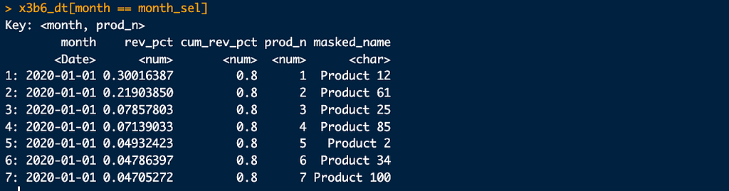
If we want to freeze products for a certain month, and see revenue from them in the whole period (what second streamgraphs shows), we can set key on product name and perform a join.
#-- freeze products
x3b6_key_dt <- x3b6_dt[month == month_sel, .(masked_name)]
list(x3a_dt, x3b6_key_dt) |> lapply(setkey, masked_name)

sel_b2_cols <- c("month", "revenue", "masked_name")
x3a6_dt <- x3a_dt[x3b6_key_dt][, ..sel_b2_cols]
And we get exactly, what we needed.
Using joins, including rolls, and deciding what can be precalculated in a warehouse, and what is left for dynamic filtering in a dashboard does require some practice, but it definitely pays off.
Inequality in Practice: E-commerce Portfolio Analysis was originally published in Towards Data Science on Medium, where people are continuing the conversation by highlighting and responding to this story.